Sometimes a Facebook post just looks a little too… normal.
You write something like: New Video Is Live
and it looks exactly like every other line in your feed.
But you can make it look more like: 𝐍𝐞𝐰 𝐕𝐢𝐝𝐞𝐨 𝐈𝐬 𝐋𝐢𝐯𝐞 or: 𝓝𝓮𝔀 𝓥𝓲𝓭𝓮𝓸 𝓘𝓼 𝓛𝓲𝓿𝓮
without installing a font or designing an image.
The process is basically:
Type your text → choose a style → copy it → paste it into Facebook.
That’s it.
The only thing I’d say before you start is: don’t make your whole post fancy.
One good-looking headline can be cool.
A full paragraph written like 𝓽𝓱𝓲𝓼 gets annoying pretty fast.
How to Create Stylish Text for Facebook Posts?
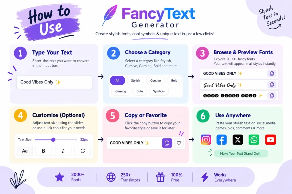
You really don’t need a ten-step tutorial for this.
Let’s say you want to post: New Course Launching Soon
Step 1: Type Your Text

Open a fancy text generator and enter: New Course Launching Soon
The generator will show different versions of the same text.
For example:
- 𝐍𝐞𝐰 𝐂𝐨𝐮𝐫𝐬𝐞 𝐋𝐚𝐮𝐧𝐜𝐡𝐢𝐧𝐠 𝐒𝐨𝐨𝐧
- 𝓝𝓮𝔀 𝓒𝓸𝓾𝓻𝓼𝓮 𝓛𝓪𝓾𝓷𝓬𝓱𝓲𝓷𝓰 𝓢𝓸𝓸𝓷
- New Course Launching Soon
Step 2: Pick Something You Can Actually Read

This is probably more important than choosing the fanciest option.
Some styles look cool for about three seconds.
Then you try reading an entire sentence in them.
Not so cool anymore.
For Facebook posts, I normally prefer something clean enough that users can understand it immediately.
This: 𝐁𝐈𝐆 𝐔𝐏𝐃𝐀𝐓𝐄
is easy.
This: ꧁༒☬𝓑𝓘𝓖 𝓤𝓟𝓓𝓐𝓣𝓔☬༒꧂
is a bit much.
You might like it, obviously.
But if people actually need to read what you’re saying, simpler usually works better.
Step 3: Copy the Style
Once you find one you like, copy it.
No download.
No font installation.
No editing app.
Step 4: Paste It Into Facebook

Paste the text into your:
- Facebook post
- comment
- bio
- group post
- page post
Then look at it once before publishing.
If one character looks strange or turns into a little box, just try another style.
That’s basically the whole process.
Wait, Are These Actually Different Fonts?
This confused us too at the beginning.
When you see: Hello
become: 𝓗𝓮𝓵𝓵𝓸
it feels like you changed the font.
But in most fancy-text generators, you’re actually using different Unicode characters that look like stylised letters.
So something like: Grow Your Business
can become: 𝐆𝐫𝐨𝐰 𝐘𝐨𝐮𝐫 𝐁𝐮𝐬𝐢𝐧𝐞𝐬𝐬
or: 𝓖𝓻𝓸𝔀 𝓨𝓸𝓾𝓻 𝓑𝓾𝓼𝓲𝓷𝓮𝓼𝓼
The useful part is that these characters can usually be copied and pasted as text.
You aren’t uploading a custom font to Facebook.
You just copy the text and paste it.
Why We Even Started Looking at Fancy Text?
The funny thing is that our generator didn’t begin because we had some genius website idea.
It started for a much simpler reason.
We wanted our names and profiles to look different.
When you’re a teenager, even tiny things on your profile feel important.
Your username.
Your profile picture.
Your bio.
Your status.
Even the way your name looks.
Sometimes you just want something that feels a little more like you. That teenage desire to make your online identity feel different is actually where the project started.
So we searched for fancy text generators.
There were loads of them.
At first, that sounded perfect.
Then we opened one.
Then another.
Then another.
And after a while it was like: Why are we seeing the same styles everywhere?
Different websites, but a lot of the actual options felt really similar. That was also one of the main observations behind the project: many generators offered limited or repetitive collections of styles even though users were looking for ways to stand out.
So instead of making another generator with the same small set of styles, we started looking at what was already available, what was missing and what actually worked.
Eventually that collection grew to 2,000+ styles.
Which sounded great.
Until we realised another problem.
Who wants to scroll through 2,000 styles just to make Happy Birthday look cool?
So categories, search and previews became just as important as having lots of choices.
That’s probably the biggest thing we learned: More options are useful only if you can actually find the good ones.
Where Stylish Text Looks Good on Facebook?
I wouldn’t use it everywhere.
Stylish text works best when you give it one small job.
1. Your First Line
Instead of: New Course Launching Soon
you could use: 𝐍𝐞𝐰 𝐂𝐨𝐮𝐫𝐬𝐞 𝐋𝐚𝐮𝐧𝐜𝐡𝐢𝐧𝐠 𝐒𝐨𝐨𝐧
Then keep everything below it normal.
The first line looks different without making the entire post difficult to read.
2. Announcements
Something like:🎉 𝐖𝐄’𝐑𝐄 𝐋𝐈𝐕𝐄
or: ✨ 𝐁𝐈𝐆 𝐔𝐏𝐃𝐀𝐓𝐄
works pretty well because it’s short.
3. Short Quotes
For example: 𝓑𝓮 𝔀𝓱𝓸 𝔂𝓸𝓾 𝓪𝓻𝓮.
Fine.
A 400-word motivational speech in the same style?
Please don’t do it.
4. One Important Line
Suppose you have an event post.
You could keep everything normal and only style:
𝐑𝐞𝐠𝐢𝐬𝐭𝐫𝐚𝐭𝐢𝐨𝐧 𝐂𝐥𝐨𝐬𝐞𝐬 𝐓𝐨𝐧𝐢𝐠𝐡𝐭
It gives that line a little more attention without turning the entire post into decoration.
A Normal Facebook Post vs a Stylish One
Here’s a simple example.
Normal version
New Digital Marketing Course
Admissions are now open for our new batch. Classes start next month.
Register today.
Slightly styled version
🚀 𝐍𝐞𝐰 𝐃𝐢𝐠𝐢𝐭𝐚𝐥 𝐌𝐚𝐫𝐤𝐞𝐭𝐢𝐧𝐠 𝐂𝐨𝐮𝐫𝐬𝐞
Admissions are now open for our new batch. Classes start next month.
𝐑𝐞𝐠𝐢𝐬𝐭𝐞𝐫 𝐓𝐨𝐝𝐚𝐲
That’s enough.
The headline looks different.
The actual information is still easy to read.
There’s no need to decorate every sentence.
Stylish Text Won’t Make a Bad Post Go Viral
This is worth saying because fancy text is easy to overhype.
Changing the way a sentence looks does not magically give you more reach, likes or comments.
If the post itself is boring, changing the letters won’t suddenly make it amazing.
Fancy text can make one part of your post visually different.
That’s useful.
But your:
- idea,
- image,
- video,
- opening line,
- story,
- offer,
- and actual message
still matter much more.
We feel the same way about our generator.
The point isn’t: “Use this and you’ll get more followers.”
That would be silly.
Sometimes you just want your name, headline or caption to look a bit different.
That is already a good enough reason to use it.
Why Does Stylish Text Sometimes Look Weird on Facebook?
This does happen.
You copy something that looks perfect in a generator.
Then you paste it somewhere and one letter suddenly looks strange.
Or you see: □
instead of the character you expected.
The reason is that fancy-looking Unicode characters don’t always appear exactly the same across every platform, device or environment.
We actually ran into this while building our collection too.
Finding a character that looked fancy wasn’t enough.
We also had to care about whether it was actually useful after someone copied it. The brand’s collection was built around filtering out styles that rendered poorly rather than keeping them just to increase the total number.
So if something looks broken on Facebook: don’t fight with it.
Try a different style.
Usually a cleaner style is the safer option.
What Makes a Good Stylish Text Generator?
After spending way too much time looking through these tools, there are a few things I care about.
Enough Different Styles
If every website gives me the same ten styles, there isn’t much point opening another one.
Variety matters.
But not random variety.
The styles still need to be usable.
Preview My Own Text
I don’t really care what: Example Text
looks like.
I want to know what my text looks like.
That’s why seeing your own text change while you browse is much more useful.
Easy Copying
Nobody wants a tutorial just to copy five words.
It should be:
Type → Choose → Copy → Paste
That simple user journey is also the product philosophy documented for BestFancyTextGenerators.com.
Categories and Search
Having thousands of styles sounds cool until you have to scroll through all of them.
If I want something:
- bold,
- cute,
- aesthetic,
- gaming,
- gothic,
- decorative,
I should be able to find that kind of style quickly.
That became one of the main reasons categories and search were added to the site.
Common Mistakes With Stylish Facebook Text
Using It Everywhere
If every single line is fancy, none of it feels special.
Use it for one or two parts.
Choosing the Most Complicated Style
Different doesn’t automatically mean better.
Ask yourself:
Can someone read this in one second?
If the answer is no, maybe use something simpler.
Using Three Styles in One Sentence
Something like: 𝐁𝐢𝐠 𝓢𝓪𝓵𝓮 Today
usually looks more messy than stylish.
One style is normally enough.
Not Checking After You Paste
Take two seconds and look at your post.
If you see a broken symbol or weird spacing, change the style before publishing.
It saves you from staring at your own post five minutes later thinking:
Why is there a random square in my headline?
Is Stylish Text Safe to Use on Facebook?
For normal text generation, you’re generally just copying generated characters and pasting them into Facebook.
You aren’t installing anything inside Facebook itself.
Still, I’d use the same basic rule I use with any online tool:
Don’t type private information into a random website if you wouldn’t normally share that information online.
Names, captions, headings, quotes and normal Facebook text are one thing.
Passwords, private account details or sensitive information are obviously another.
Can I Use Stylish Text in Facebook Comments?
Yes, you can usually copy supported text and paste it into comments too.
The same rule applies:
check it after pasting.
If the characters don’t display properly, use another style.
Does Stylish Text Increase Facebook Engagement?
I wouldn’t promise that.
Stylish text can make one line visually different from the normal text around it.
That may help the line stand out visually.
But that does not mean Facebook will suddenly give the post more reach or people will automatically start liking it.
Your actual content still matters much more.
Should I Make My Whole Facebook Post Stylish?
I wouldn’t.
Maybe use it for:
- the first line,
- an announcement,
- a short quote,
- a name,
- an important sentence,
- a CTA.
Then keep the rest normal.
It usually looks cleaner.
What’s the Best Stylish Font for Facebook?
There isn’t one.
It depends on what you’re posting.
For an announcement, I’d probably choose something bold and readable.
For a personal post, you can experiment more.
For a quote, maybe something slightly more decorative.
The best style is basically the one that: looks good + still lets people read your text easily.
Try It With Your Own Facebook Text
You don’t have to imagine what your post will look like.
Take whatever you were about to write on Facebook and try it in Best Fancy Text Generators.
The idea behind the tool is simple:
Type your text → browse the styles → preview your own words → copy the one you like → paste it into Facebook.
The collection now includes 2,000+ styles, but the goal was never just to throw thousands of random characters onto a page. The whole product was built around providing more useful choices and making those choices easier to discover.
Final Thoughts
Stylish text isn’t some secret Facebook trick.
And honestly, it doesn’t need to be.
Sometimes: Happy Birthday
just looks more fun as: 🎉 𝓗𝓪𝓹𝓹𝔂 𝓑𝓲𝓻𝓽𝓱𝓭𝓪𝔂
Sometimes you want: New Video
to stand out at the top of your post.
And sometimes you just want your name to look different because the normal version feels boring.
That tiny desire to make something feel more personal is basically where our entire project started.
We wanted more choices.
We kept finding the same styles.
So we started looking for what was missing.
Then we discovered that more styles created another problem: finding the right one.
And that slowly turned into what the site is now.
But you really don’t need to care about any of that when you’re using it.
You bring the words.
Find something that feels like you.
Copy it.
Paste it.
Done.
Related Articles:
- Fancy Text Not Working on Instagram or Facebook – Fixes
- How to Copy and Paste Stylish Text Anywhere
- Is Unicode Text Safe for Social Media Platforms?

Ankit Thakur is an SEO Specialist and WordPress Developer with 4+ years of experience. He has generated ₹60L+ in revenue through SEO, built 50+ websites, and helped businesses generate measurable leads through organic search and local SEO.