Have you ever copied some fancy text, pasted it somewhere, and thought:
“Wait… why does this look different now?”
Maybe it looked perfect in the fancy text generator, but after you pasted it into Instagram, WhatsApp, a game, or another app, the letters looked slightly different.
Sometimes a character can even turn into a weird box.
It’s annoying, but there’s a pretty simple reason:
Fancy text doesn’t have one fixed appearance everywhere.
The characters stay the same, but the way they are displayed can depend on the app, device, operating system, and the fonts available on that system.
And this is something we actually ran into while building BestFancyTextGenerators.com.
First, What Is Fancy Text Actually Using?
When you type normally, your keyboard gives you standard letters.
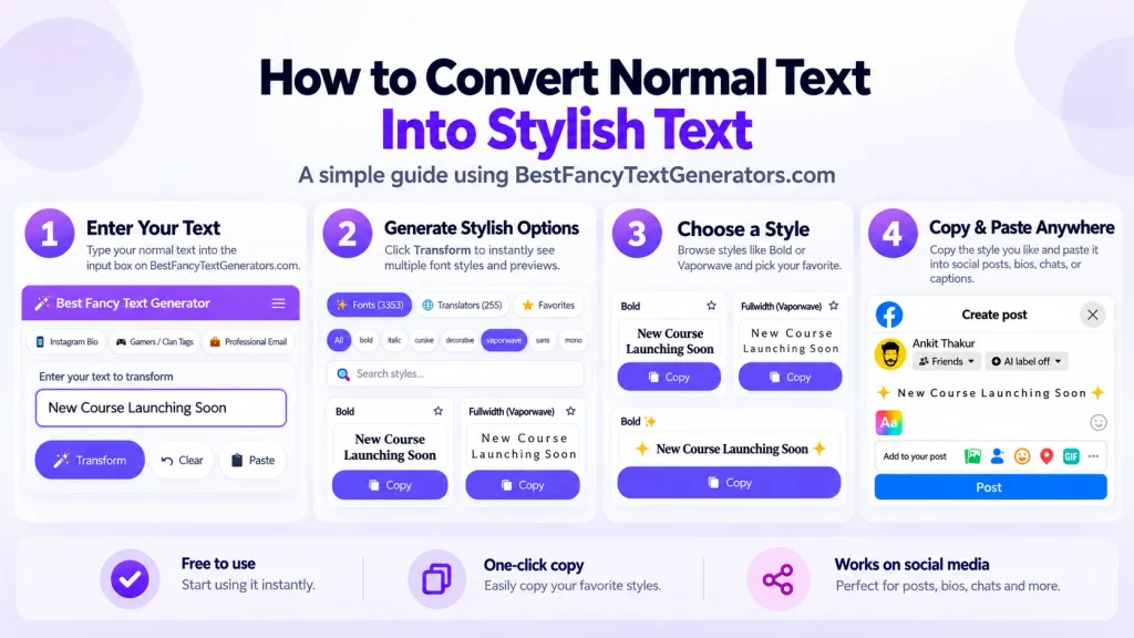
For example:
Hello
A fancy text generator can turn that into:
𝓗𝓮𝓵𝓵𝓸
or
𝕳𝖊𝖑𝖑𝖔
or
Hello
It looks like you changed the font, but in most cases that’s not what happened.
Fancy text generators usually replace normal letters with different Unicode characters that have a different visual appearance.
That’s why you can copy the result and paste it into another app without installing a font file.
But there’s one important catch:
Not every device or app displays every Unicode character in exactly the same way.
Why Does Fancy Text Look Different on Different Platforms?
Let’s say you create a fancy version of your name: 𝓐𝓷𝓴𝓲𝓽
It looks perfect in the generator.
Then you paste it into another app or send it to a friend, and it looks slightly different.
That happens because there are two separate things involved:
1. The character itself
2. How that character is rendered
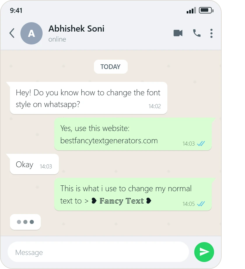
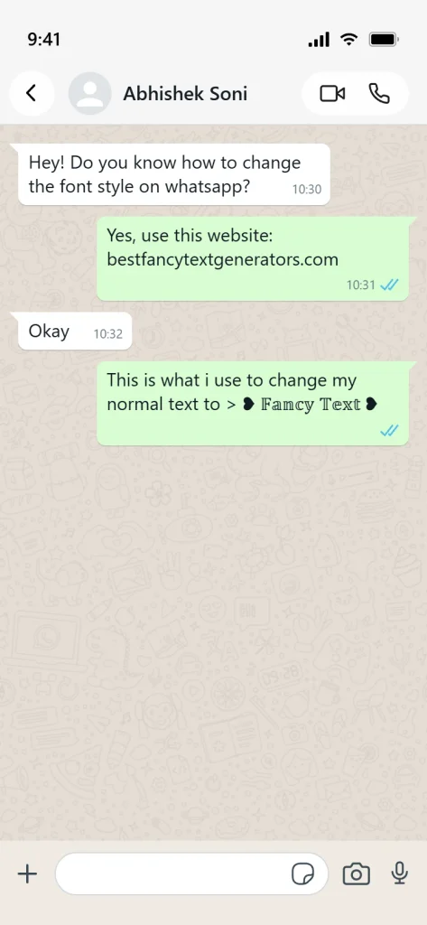
The generator gives you the Unicode characters.
Your device, browser, operating system, app, and available fonts decide how those characters actually appear on the screen.
If the system has good support for that character, it may display normally.
If not, it may:
- use a fallback font,
- display the character a little differently,
- show a missing-character symbol,
- or display a box like: □
So the text itself may still be the same while its appearance changes.
Your Device, Fonts, and App All Matter
Different devices do not always use the exact same fonts or rendering systems.
That means the same Unicode character can sometimes look slightly different on:
- Android
- iPhone
- Windows
- macOS
- web browsers
- Discord
- games
- other apps
The app itself may also affect what you see.
Some apps display a character using the system font.
Others may use their own fonts or rendering rules.
So instead of assuming: “This style works exactly the same everywhere.”
it’s better to think: “This style works here, but I should still check it where I actually plan to use it.”
Why Do Some Fancy Characters Turn Into Boxes?
That little square box usually means the device or app doesn’t have a suitable glyph available to display that character properly.
In simple terms:
The character exists, but the system doesn’t know how to draw it.
That’s why you might see: □
or another missing-character symbol instead of the fancy letter you expected.
If that happens, the easiest solution is usually to try another style.
We Ran Into This While Building Our Own Generator
This wasn’t just something we learned from reading about Unicode.
It became part of the actual work behind BestFancyTextGenerators.com.
The original idea started because we wanted more ways to make our own names and text look different.
When we looked through existing fancy text generators, we kept seeing many of the same popular styles.
So we started checking:
- what styles were already available,
- what was missing,
- what other variations could be created,
- and most importantly, which styles actually worked properly.
That last part became important pretty quickly.
Just because a character looks fancy doesn’t mean it’s useful.
Some characters looked interesting but didn’t render properly or behaved inconsistently.
Those styles weren’t worth keeping just to increase the number of options.
That process eventually helped the collection grow to 2,000+ styles, but the number itself was never the main goal.
The real goal was: Find more styles people can actually use.
Fancy Doesn’t Always Mean Better
This is probably one of the easiest mistakes to make.
You see a really complicated style and think: “This one looks insane.”
Then you paste it into your bio and suddenly nobody can read your name.
Not exactly what you wanted.
Different situations need different styles.
For example:
| Where you’re using it | What usually works better |
|---|---|
| Instagram bio | Clean and readable |
| Gaming username | More decorative or unusual |
| WhatsApp name | Simple fancy text |
| Discord profile | Creative but readable |
| Important business info | Mostly normal text |
| Casual message | Anything you like |
There isn’t one perfect style for everything.
What We Look For When Adding Styles
After working through this problem, we ended up asking two different questions:
Does it look interesting?
and:
Can someone actually use it?
The second one matters more.
A style can look great in a preview, but if it breaks after copying or becomes impossible to read, it isn’t very useful.
That’s why the collection focuses on:
- finding genuinely different styles,
- excluding styles that don’t work properly,
- keeping the results easy to preview,
- making useful styles easier to find.
The experience should still feel simple:
Type → Choose → Copy → Paste
You shouldn’t need to understand Unicode, fallback fonts, or rendering systems just to make your name look different.
How to Avoid Problems With Fancy Text?
If you’re using fancy text somewhere, here’s what I’d do:
1. Don’t choose a style only because it looks complicated
A simpler style can often look cleaner and work more reliably.
2. Check the text after you paste it
The generator preview is useful, but the final app is what matters.
3. If you see boxes or missing characters, switch styles
That usually means the character is not being displayed properly in that environment.
4. Keep readability in mind
If people can’t understand your name or bio, the style is doing too much.
5. Test important text in more than one place
If the text matters, such as a business name or profile heading, check it on the actual app and, ideally, on another device too.
6. Keep important information simple
Fancy text works best as decoration.
For things like:
- contact details,
- business information,
- important instructions,
- essential profile text,
normal text is often the safer choice.
Can You Make Fancy Text Look Exactly the Same Everywhere?
Not always.
You can choose widely supported styles and reduce the chance of display issues, but there is no guarantee that every app, device, browser, and operating system will render every character identically.
That’s why checking the final result matters.
A style that looks good on your phone might look slightly different on someone else’s.
That doesn’t necessarily mean the text changed.
It usually means the system displaying it is using a different font or rendering method.
Try It Yourself
One of the easiest ways to understand this is to test the same text yourself.
Use our Fancy Text Generator, generate a few different styles, and paste them into the platforms you actually use.
Try the same text in:
- Discord
- a browser
- another device
Then compare the results.
You’ll usually find that some styles are more consistent and readable than others.
Frequently Asked Questions
Why does fancy text look different on different platforms?
Because Unicode characters can be rendered using different fonts and rendering systems depending on the device, operating system, browser, or app.
Why do I sometimes see a box instead of a fancy character?
That usually means the device, app, or available font doesn’t have a suitable glyph to display that character.
Why does my fancy text look fine in the generator but different after I paste it?
The generator displays the text in its own environment. The app or device where you paste it may use different fonts or rendering rules.
Does the text itself change when I paste it?
Usually, no. The Unicode characters can remain the same while their visual appearance changes depending on how they are rendered.
Can I make fancy text look exactly the same everywhere?
Not always. You can reduce problems by using simpler, more widely supported styles and checking the final result where you plan to use it.
Should I always use simple fancy text?
Not necessarily.
A decorative style can work well for a gaming username or casual profile.
For important information, simpler styles are usually easier to read and more reliable.
Final Thoughts
Fancy text usually isn’t changing when you move it from one app to another.
What changes is how those characters are displayed.
Different devices, apps, operating systems, and fonts can render Unicode characters in slightly different ways.
That’s something we learned firsthand while building BestFancyTextGenerators.com.
At first, we simply wanted to find more styles.
Then we realised something more important:
A style that looks fancy isn’t useful if it doesn’t work properly.
That became one of the principles behind the collection: more useful choices, not just more random characters. The broader product story reflects that same philosophy—working styles mattered more than simply increasing the collection size. Best Fancy Text Generators — Co…
So if your fancy text looks strange after you paste it somewhere, don’t assume something went wrong.
Try another style.
Sometimes the simpler one works better anyway.
Related Articles:
- Why Unicode Fonts Are Not Supported Everywhere
- How to Make Fancy Text Compatible Across Devices
- Why Some Fonts Dont Display on Mobile Devices
- What is Fancy Text?

Ankit Thakur is an SEO Specialist and WordPress Developer with 4+ years of experience. He has generated ₹60L+ in revenue through SEO, built 50+ websites, and helped businesses generate measurable leads through organic search and local SEO.